The Central
ART DIRECTION/ DESIGN
The Ask
Develop logo options for the AFH Central Region new visual identity.
Must haves:
The total Central Region includes Texas, Midwest, and Plains.
Logo should convey strength and incorporate imagery that represents the
geography of all three regions.
Must include Frito-Lay and Quaker logos.
PROCESS
The client sent over examples of other regions' logos and preferred iconography. After reviewing the brief and all materials, I began ideating and sketching!
Because this logo incorporates geogrpahic landmarks, I was really inspired by National Park logos and knowing that this mark would be used on a range of assets, I wanted to create a holding shape so it could easily live on different colors and be added to to other visual elements with realtive ease.


LOGO ROUND 1
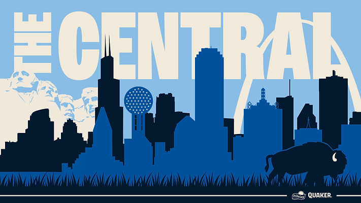
Overall this logo visually unites diverse regions through a cohesive and symbolic mark. It features graphic elements drawn from recognizable landmarks and landscapes: Reunion Tower, Willis Tower, the Gateway Arch, sweeping plains, and a buffalo, each representing a unique part of the broader regional identity.
The holding shape acts as a unifying container, giving the composition structure.
The color palette adheres to the brand’s established identity, ensuring alignment with existing visual standards and other regions' logos.

LOGO ROUND 2
While the client loved the overall look, they wanted to reduce the number of colors, reduce the height of the holding shape, emphasize the towers and include Mount Rushmore. We reworked the design with those edits in mind and presented version 2.

LOGO FINAL ROUND
Third times a charm! We made slight revisions to heirarchy and further reduced the color palette further and landed on The Central Region's new visual identity! Time to blow it out to other digital assets!

DIGITAL ASSETS
Now that we had a logo, it was time for our team to create digital assets. Our client needed a powerpoint template and individualized Zoom backgrounds for each area of the region.


